Half designer. Half pizza.
Codes proficiently
Daniel is a skilled front-end developer who has written at least several hours of code.
Lives in NYC
Because when you’re going to apply for a job in NYC, it can be very important to live there.
8 Year Veteran
With his experience, Daniel is well suited for senior roles, like Director of Sugary Snacks.
"I personally loved working with Daniel. What's that? Oh ok, different Daniel."
— Joshua Jenkins"I met him once. Weird guy. Kept mumbling about pizza."
— Shawna X"I don't know that name. He's a designer? Probably sucks."
— Luke SeeleyTreehouse Cards
Lead design and front-end development
Treehouse Tracks
Lead design and front-end development
Treehouse Home
Lead design and front-end development
Treehouse Card Language
Overview
In the Treehouse app, cards represent consumable content. Each Track, Course, Workshop, or even Conference is represented by a card, with varying characteristics to help visually explain what type of content it is, as well as what state that piece of content is in. Cards have an icon denoting content type, headers colored by primary topic (CSS, Ruby, etc.), can be bookmarked, shown with no activity, in progress or completed, new, available only to Pro users, coming soon, stacked to represent Tracks, and more. This versatility is essential in keeping the Treehouse learning experience as consistent as possible for our students.
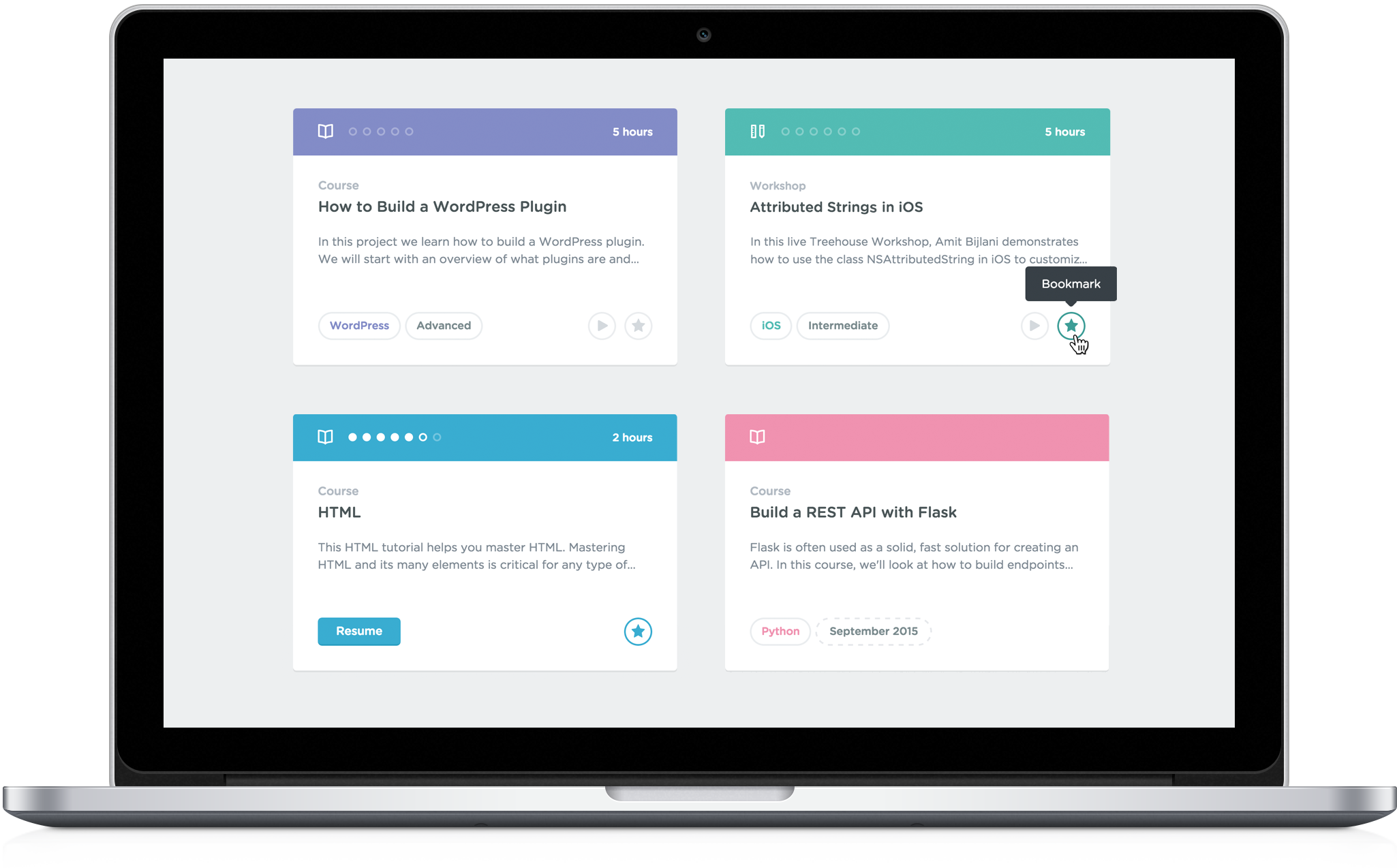
The final, production version of Cards.
Project Goals
Before developing a cohesive, global visual language at Treehouse, "cards" for consumable content existed almost in spite of themselves, more of a visual flourish than as a useful conveyer of essential information for the represented content. There was no course description, courses could not be started from the card itself, course progress was displayed vaguely, the cards didn't scale well responsively, and while we thought the custom artwork for each piece of content added personality, they were becoming burdensome for our visual designers to create as content production rapidly increased.
We set out to improve this experience by creating a more flexible and versatile card language that would better inform and empower the student experience, not constantly require new asset production, and also scale well across platforms with varying levels of abstraction.
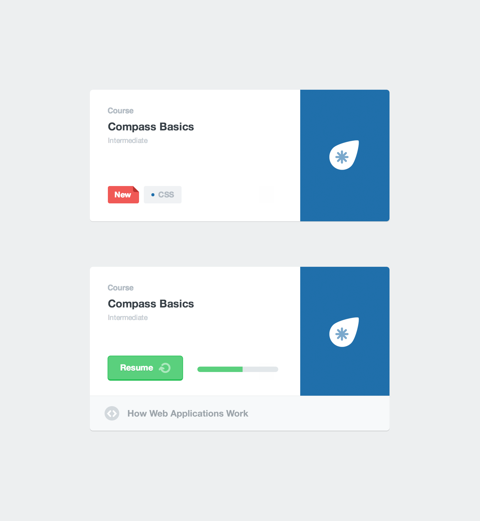
The content cards we set out to improve. You'll notice that the top (default state) card had no method for accessing the content without clicking the card and first be taken to the individual course page.
Project Exploration
My initial instinct was to first solve the issue of horizontal responsiveness. A topic-colored bar was added to the top of the card and the course artwork was moved to a top left alignment. This solved the horizontal responsiveness issue, but suddenly our custom artwork that was designed to be shown at a larger scale wasn't so impressive. I chose to wait to tackle other issues until the basic card structure could be further fleshed out.
In my second exploration, round action buttons, time estimates and a more granular course step count were added to course cards. Tracks and Collections (RIP) were shown as visually distinct from course cards by making them taller with the potential for Collection cards to feature imagery or other artwork rather than topic colors. Other additions included difficulty tags inline with topic tags, trailer and course listing buttons on Track cards and generic content type icons added to Track and Collection cards.
The third exploration has us ditching the taller Track cards for a stacked card metaphor to visually explain that there are multiple courses contained within. Bookmarking buttons were further fleshed out and the problem of no Start button was solved by offering one up once the course had been bookmarked. Various states are displayed, including 2 potential Home and Track cards.
A fourth exploration involved mocking up cards in a potential, more contextual Library design. Topic cards with topic-themed artwork were also added.
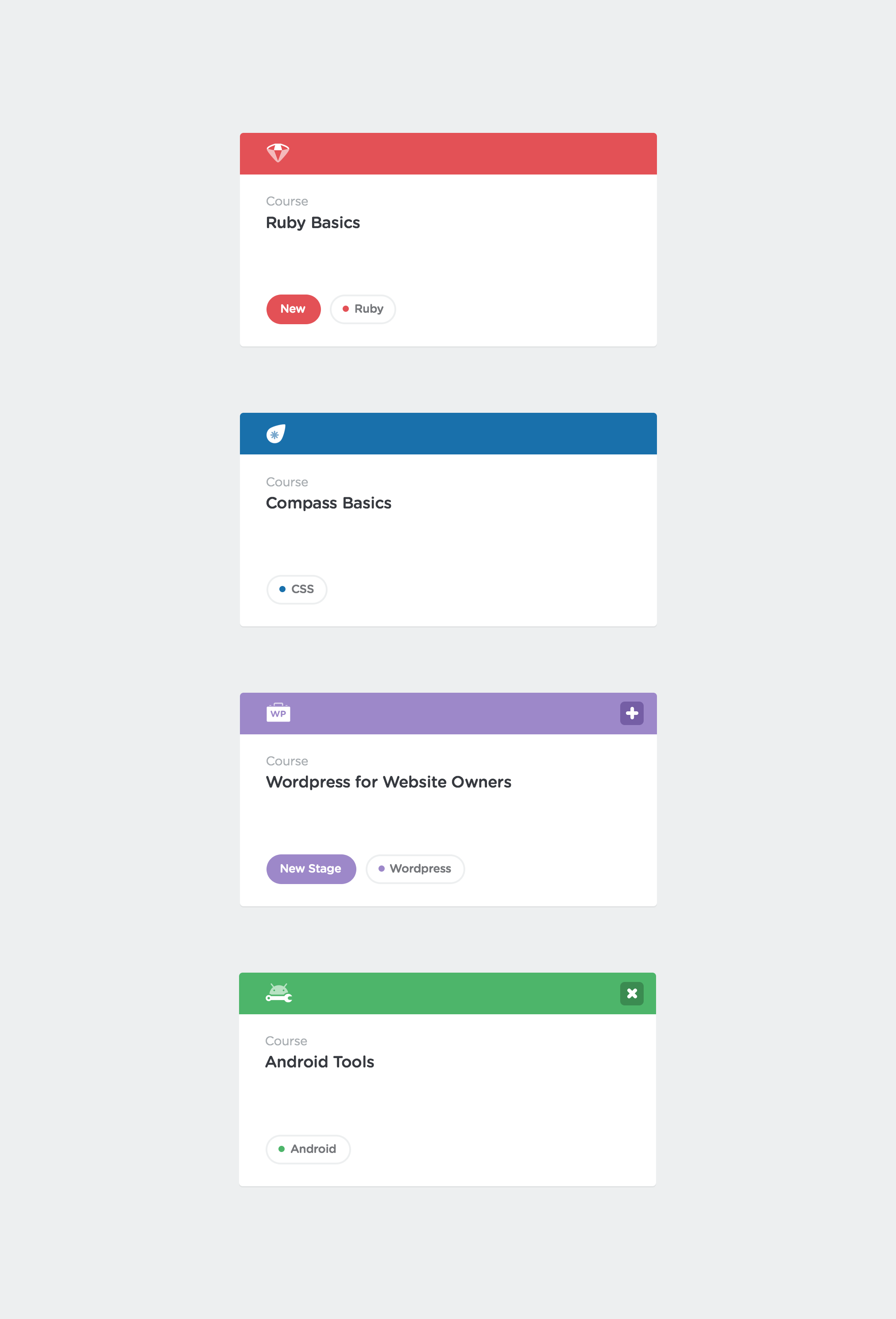
One idea included in this first exploration that made it to production were pill-shaped tags.
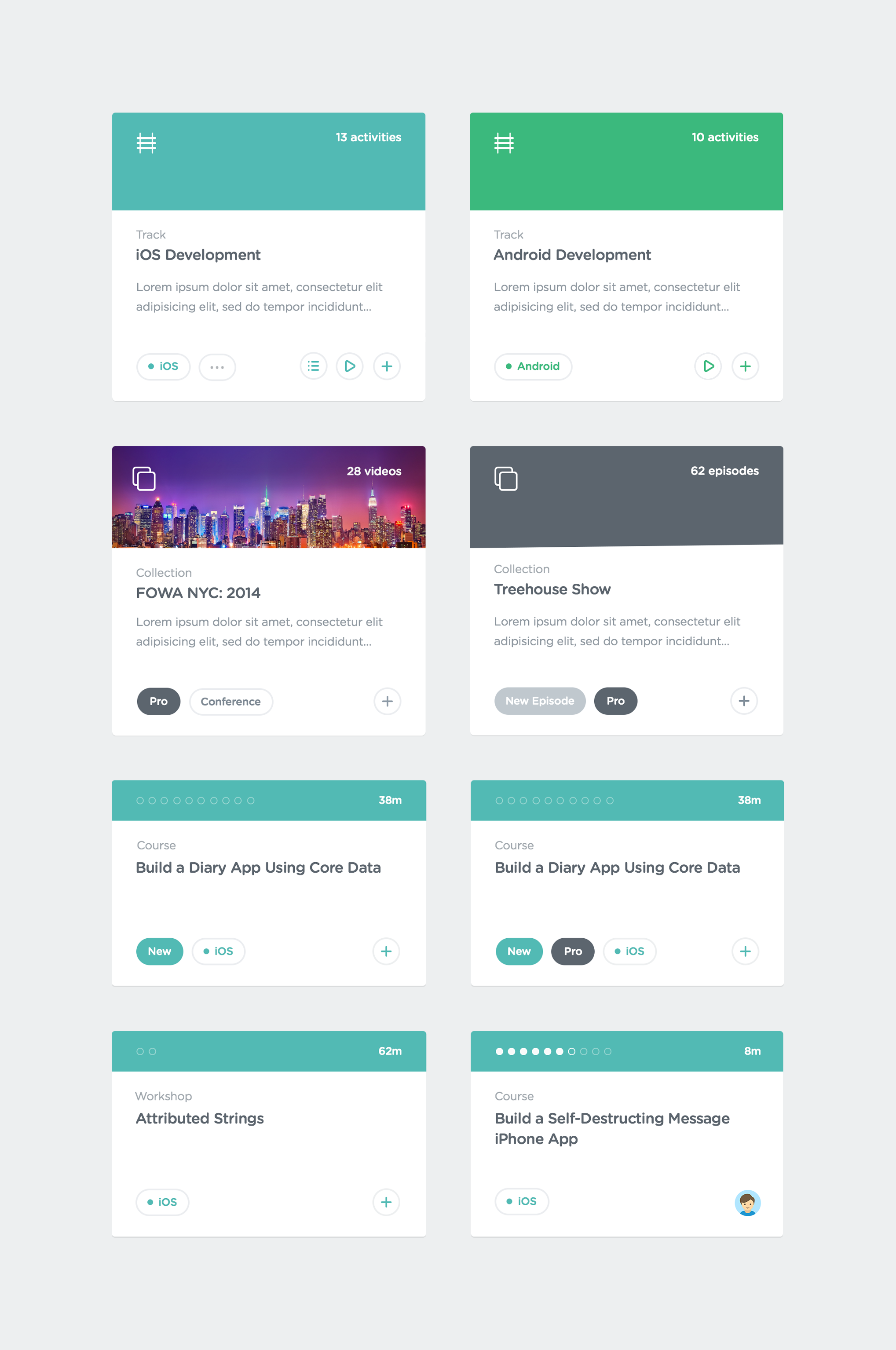
This second exploration of the basic card structure features new card elements applied to various content types.
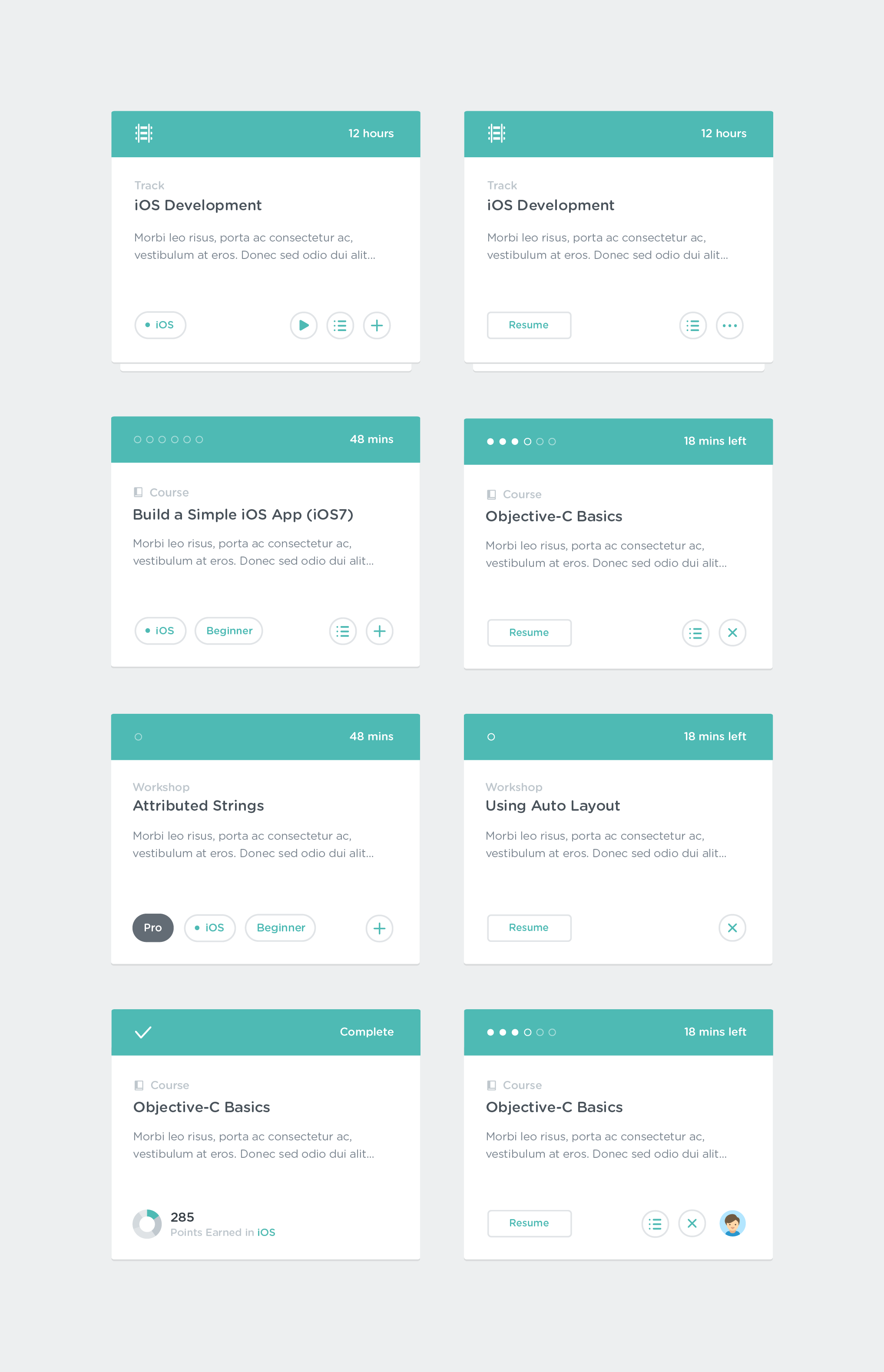
This third exploration got us much closer to the production cards, as each interaction was explored in depth and the design adjusted accordingly.
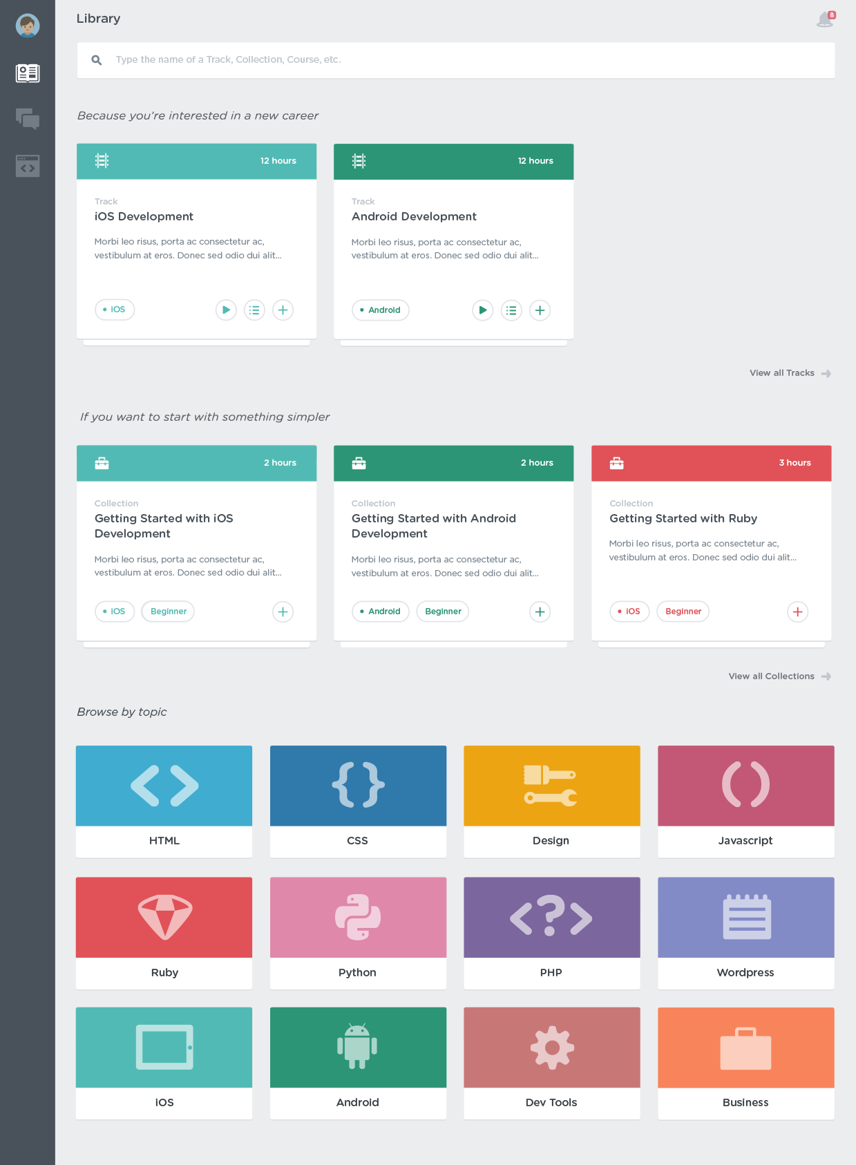
The Library exploration was extraordinarily helpful for us to see how the various content type and topic cards would live together.
Project Result
The production cards included a few key additions: unique content type icons for each card to distinguish between Tracks, Courses, Workshops, Conferences and other bonus content, an updated bookmark icon and new button interaction, trailer play buttons for individual courses, as well as date tags for upcoming content card states.

A screenshot of the current Library on production. While not quite as granularly contextual as my initial exploration, this redesign still resulted in massive improvements in student engagement.
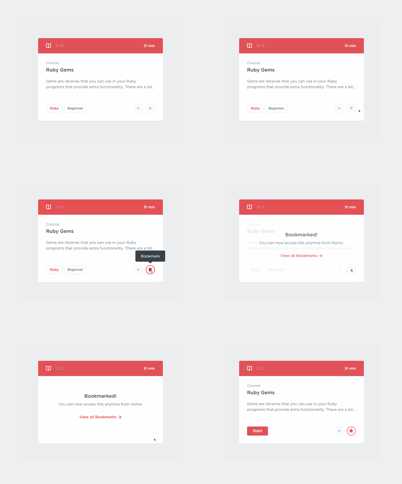
Animation detailing the bookmarking interaction for content cards.
Treehouse Tracks
Overview
Tracks are teacher-curated, guided playlists of courses intended for students who want to gain basic proficiency in a number of concepts. Originally called Adventures and cobbled together from a limited selection of content at the outset, they evolved into allowing us to set up our own curriculums. As a result, students could learn these larger concepts in an order our teachers deemed ideal. We quickly devised a tree-style progression dynamic for Tracks and released Tracks to our students without any user testing. We had also already begun to move the card language project forward to a point where the Track course cards were soon outdated. I then proposed an updated design to solve various UX flaws that were quickly uncovered with the original, rushed design, with the added impetus of incorporating the new card language.
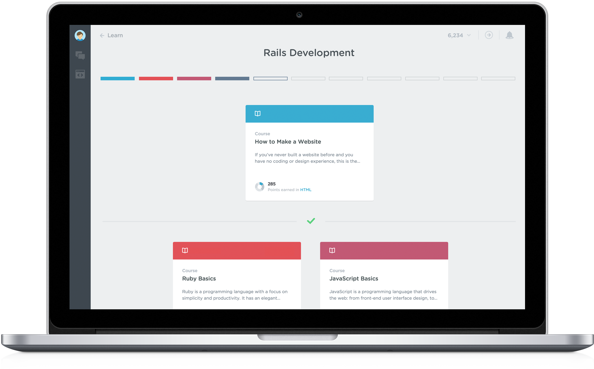
The final, production-ready concept of the Tracks redesign.
Original Concept
Tracks were originally envisioned with tiers that would be "unlocked" as you progressed through the previous tiers. Some students did not take to this model because there was no way for them to skip through content they had already mastered. Adventures had no restrictions, and with no mechanism for testing out of locked tiers, we quickly realized the futility of fighting an impossible battle to convince students that they should waste their time trudging through content they had already learned outside of Treehouse.
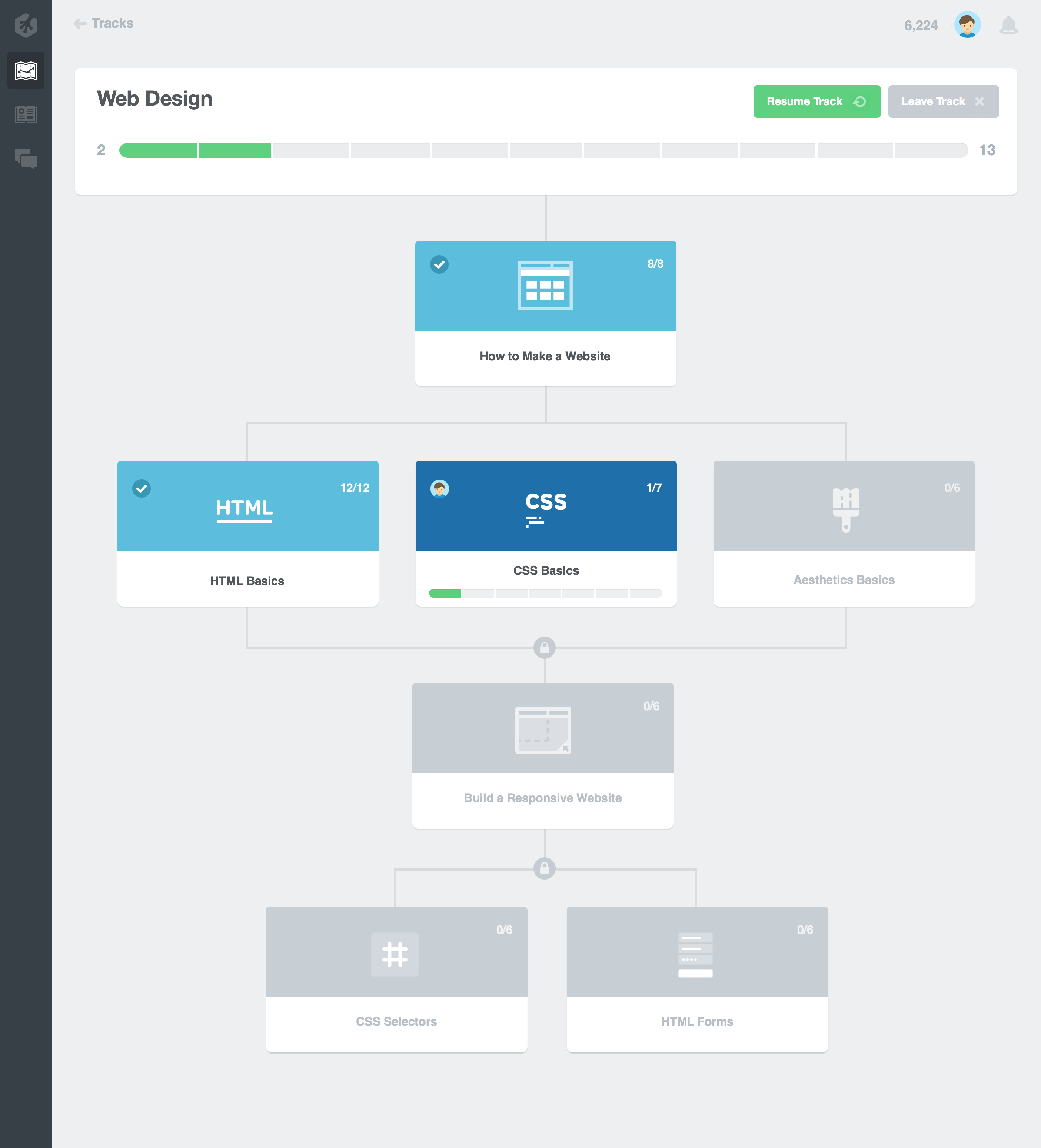
The original concept for Tracks. The card language seen here and on production was improvised before a global card language was established and was a variation of the Library card language at the time.
Production
On production, a temporary fix was soon deployed that removed all locks and allowed students to freely progress through Track courses out of order if they wished—and only after a reminder recommending that students take courses in the prescribed order. This mostly solved student outrage, but Tracks were still fundamentally flawed without the ability for us to be able to reliably gauge student knowledge after completing a Track.
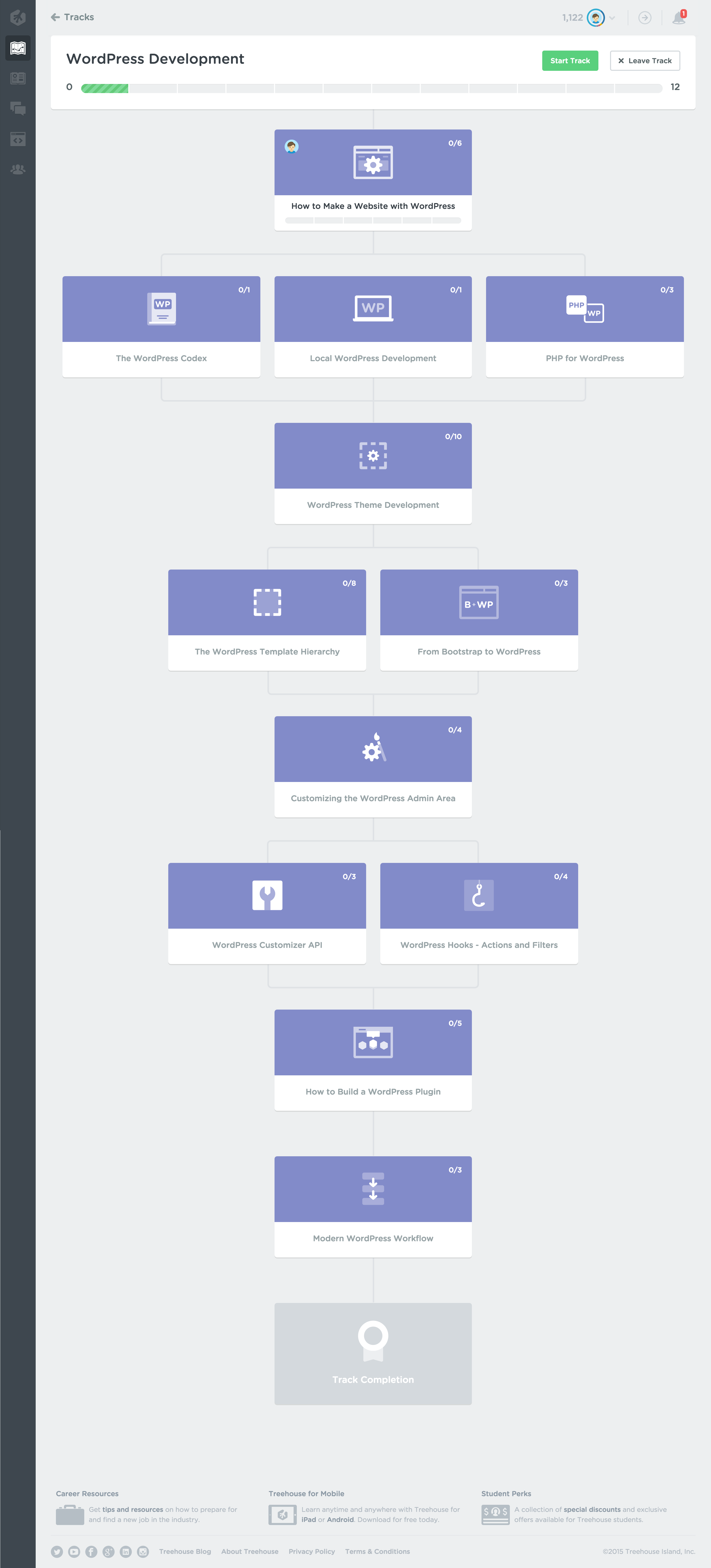
The current "Wordpress Development" Track on production. This design hasn't been updated in over a year, neglected and lacking even a card language update.
Project Goals
Student feedback also made it clear that the tree structure was confusing. Resuming was awkward, with no visibility given to the current course once courses in the tree below the initial fold were in progress.
The primary goals of the redesign project were thus to: a) design the mechanism for which students could test out of tiers, b) apply the new card language to Tracks and c) to make resuming more contextual.
Project Exploration
This early exploration simplified the tree structure without removing it entirely, introduced a non-contextual global resume card, and a mechanism to test out of content tiers. The Track progress bar was also overhauled, introducing topic-colored bubbles that correlated to the topic color of the represented course, as well as mimicking the progress bubble states of the new card language.
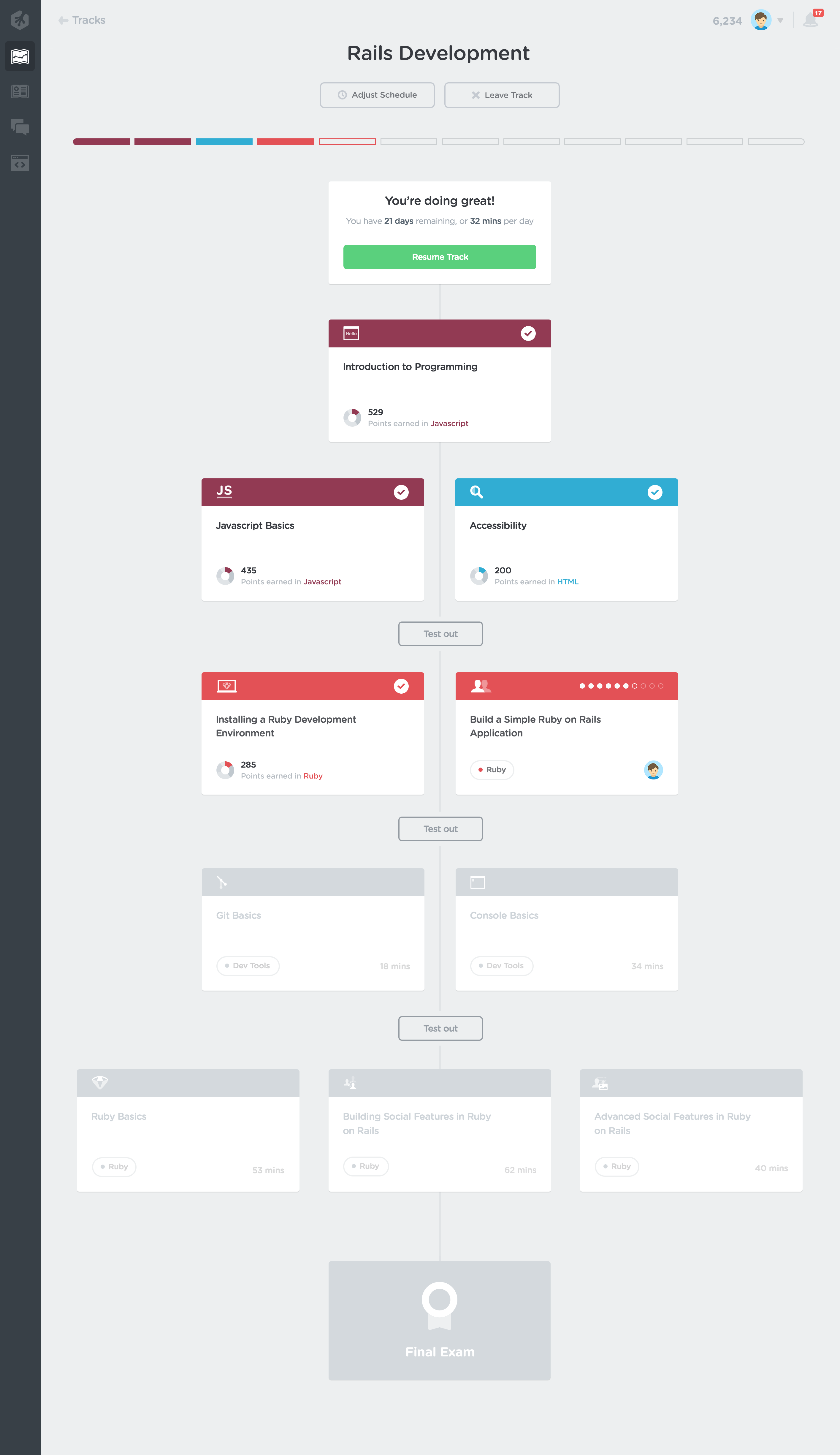
A very early iteration of the new card language can be seen in this exploration.
Project Result
This production-ready mockup replaced the early card language with the production language, topic-colored the global resume button that correlated to the course currently in progress, added the current course and shifted schedule adjustment to the global resume card, and removed the tree structure entirely in favor of simple sectioned tiers. Each section could hypothetically contain 1-3 courses and once complete, each tier's "Test out" button would be replaced by a checkmark.
However, because of recently shifting priorities, designers on the Web Team focused most of our energy on increasing engagement and removing friction from the core experience in order to hopefully stifle attrition. This restructuring and visual overhaul was then shelved until resources could be made available for Tracks to include exercises (new practice content) and for a robust testing system to be built on top of our existing Code Challenge engine. In the meantime, new Tracks have simply been made flat/linear with one course per tier in order to at least make the order of progression more obvious in the tree structure.
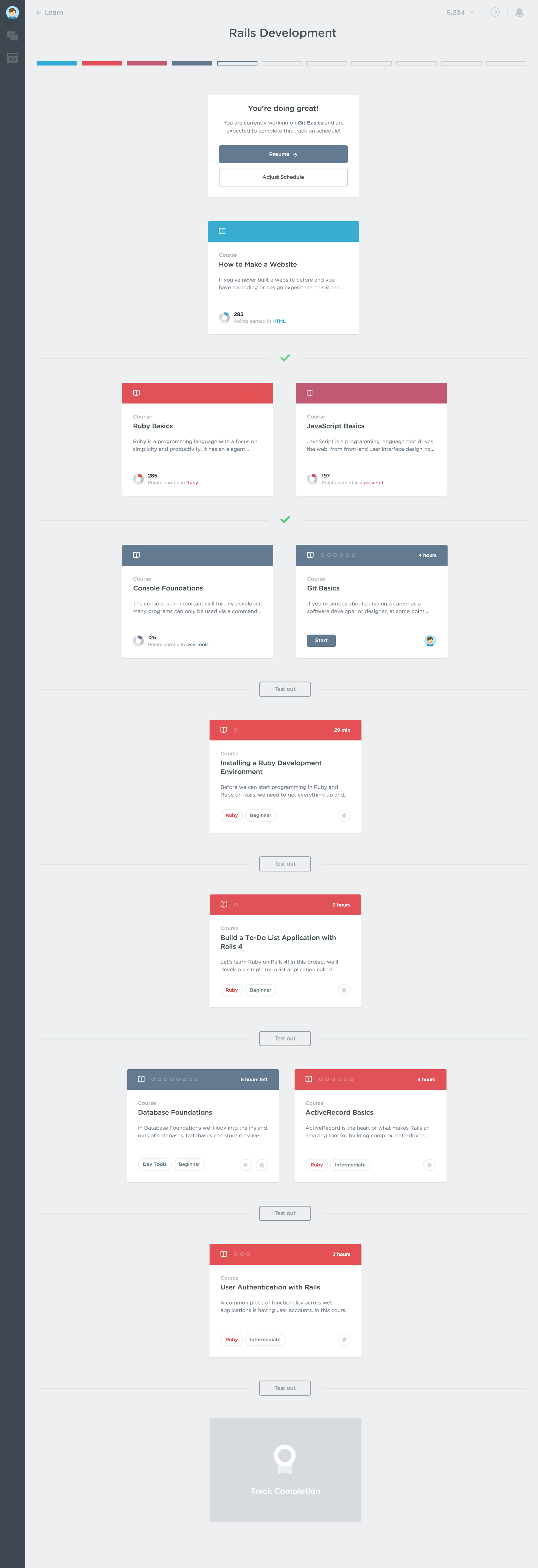
This production-ready mockup shows an in-progress Track state.
Treehouse Home
Overview
Home is the Treehouse student's learning control center where students can view and manage their in-progress content, as well as their bookmarked and completed content. Home also gives students content recommendations and encourages them to keep working towards their goals.
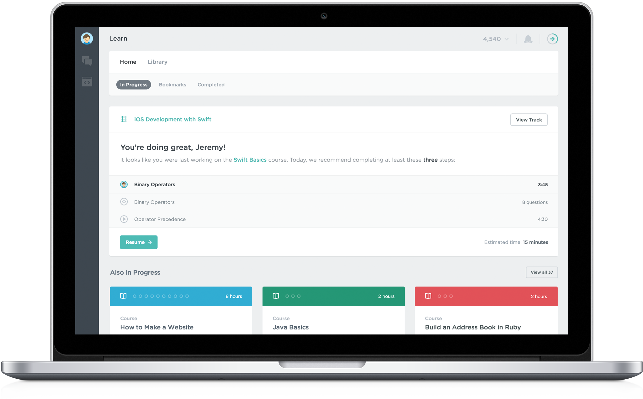
The final, production version of Home.
Previous Iterations
Orignally called "Dashboard," these were essentially just simple aggregators. There was no filtering, just a firehose of in-progress content. The original Home had no way to remove content without completing it, until we built a basic bookmarking system we so cleverly called "Add to Home." This allowed students to pin content to Home, but more importantly, to remove it. This visual language was also consistent across the Treehouse app at the time; bold and slightly cartoonish, it was heavy on visual impact but like any early iteration, the UX design needed time to mature.
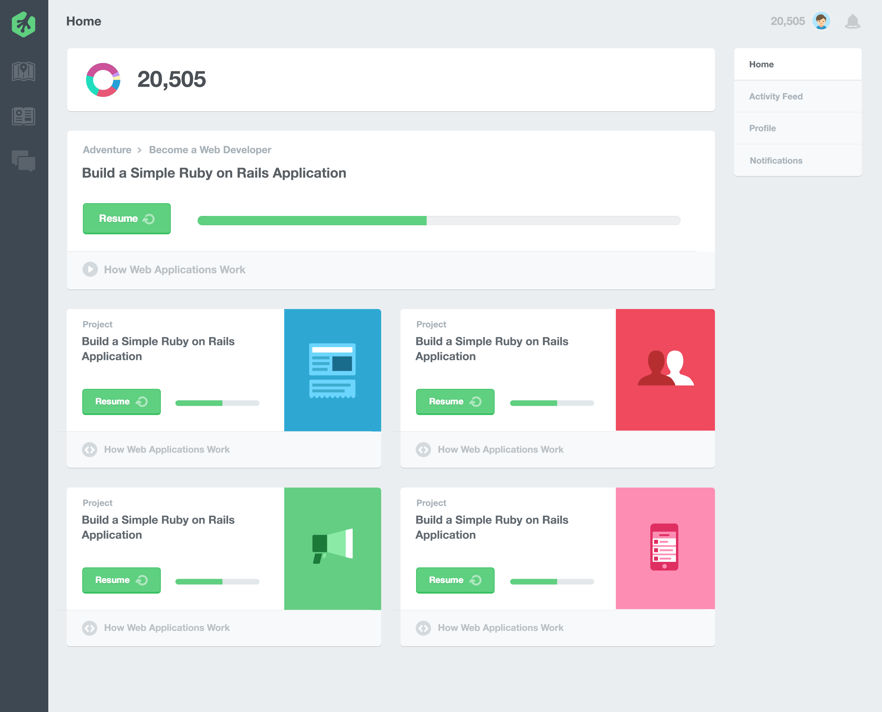
A mockup of the original Home, renamed shortly after we introduced a new app design and visual language.
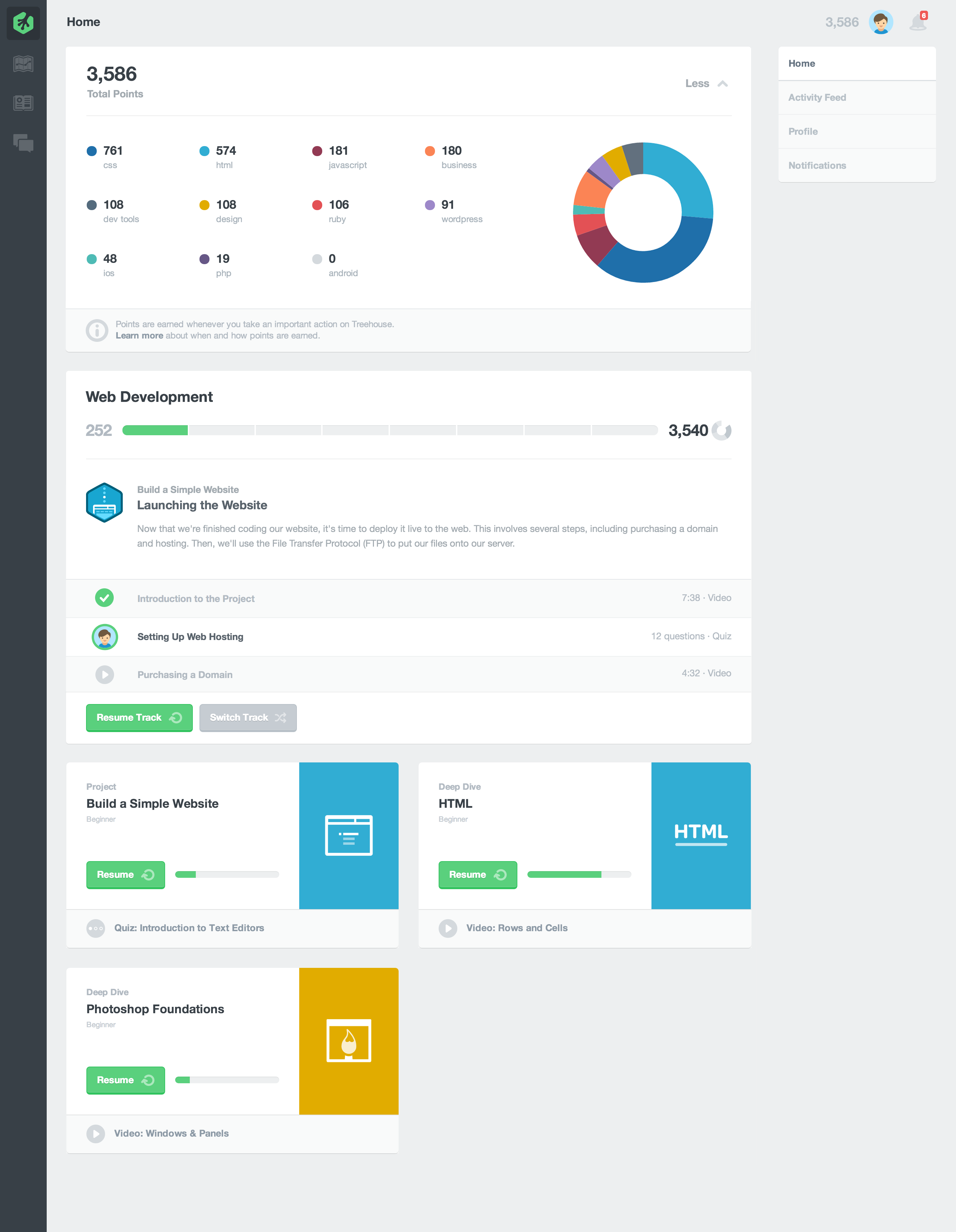
The second iteration of Home, which included an expanded points display and detailed Track panel.
Goals
The goals of the third major Home iteration was to make it more manageable. We wanted to remove the firehose, de-emphasize points as a primary measure of Treehouse progress, and introduce the new global card language, which also required the addition of Bookmarks and Completed content filters.
Home wasn't broken, but it wasn't necessarily prioritizing or explaining anything well either. Firehoses are always difficult to manage, and firehoses without filters are just dumb, especially for active students. Creating a more robust bookmarking system would allow us to ditch the firehose and show only the most relevant in-progress content at a glance. We also wanted to relegate points to a student's profile, as we no longer thought they were an accurate measure of actual knowledge. While the Track panel worked well, we thought it could have even more utility as a content recommendation/encouragement panel for both Track and non-Track students.
Project Explorations
Around this time, we became pretty big believers in contextual recommendations being the way forward for our students and began to explore ways we could begin integrating these across the product while we built a more robust recommendation engine. In this exploration, a first iteration of the content recommendation panel has been designed and I was experimenting with showing the next recommended piece of content immediately below the panel. The context for the recommendation is listed above the content.
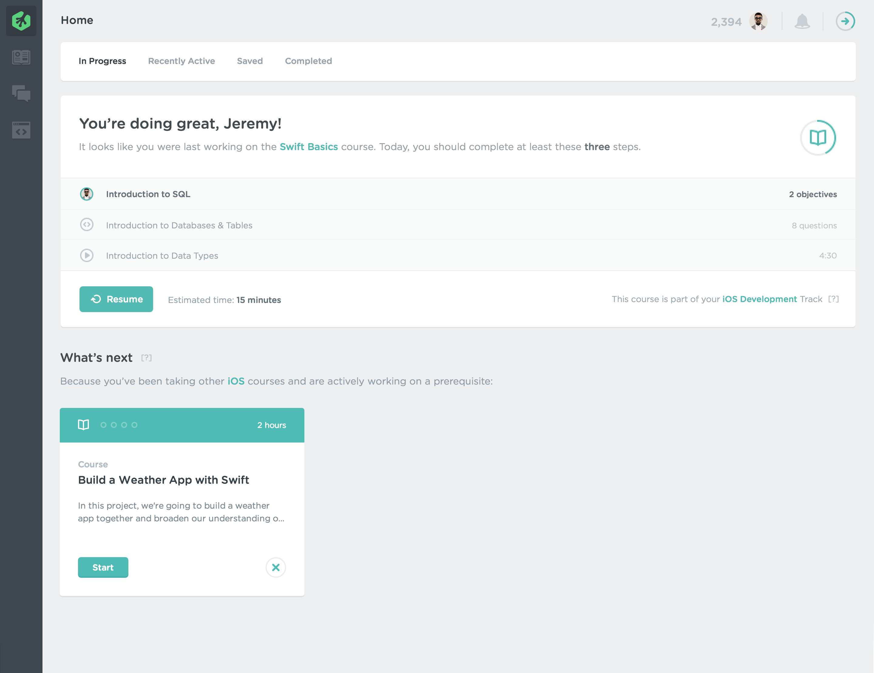
In this mockup, Bookmarking was at the time called "Save to Home," hence the "Saved" filter.
Project Result
On production, students are still shown a recommendation panel at the top of Home with a reminder of what they were last working on, and encouragement to complete at least a few steps that day. If they have recently completed content, the panel recommends related content, drawing from your usage history as well as from your Bookmarks. If students have joined a Track, the next course in their Track will be recommended and their Track will be listed at the top of the panel. Up to three other in-progress content cards are shown by default, with a link added to show all in-progress content.
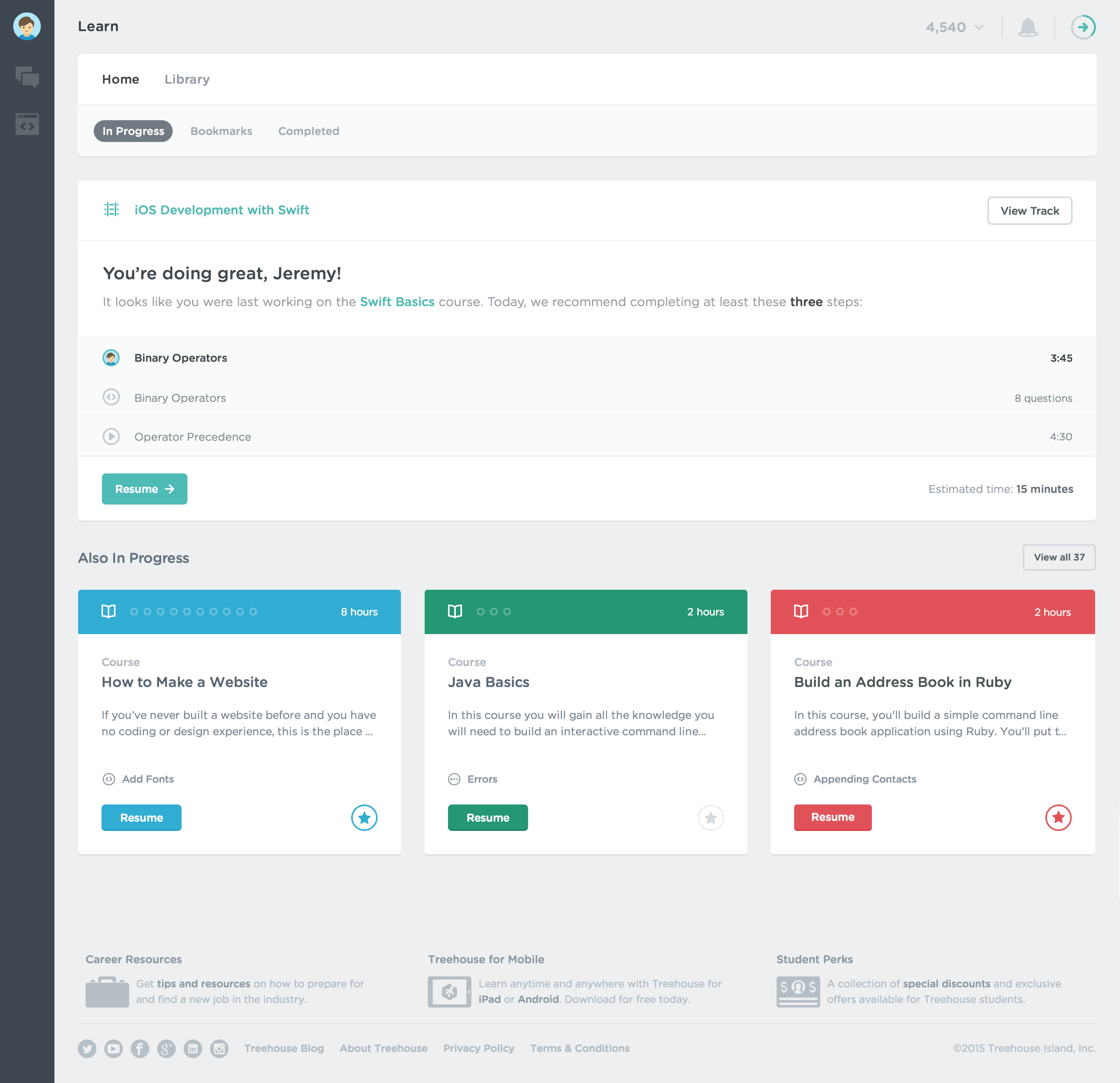
A more complete look at Home on production.